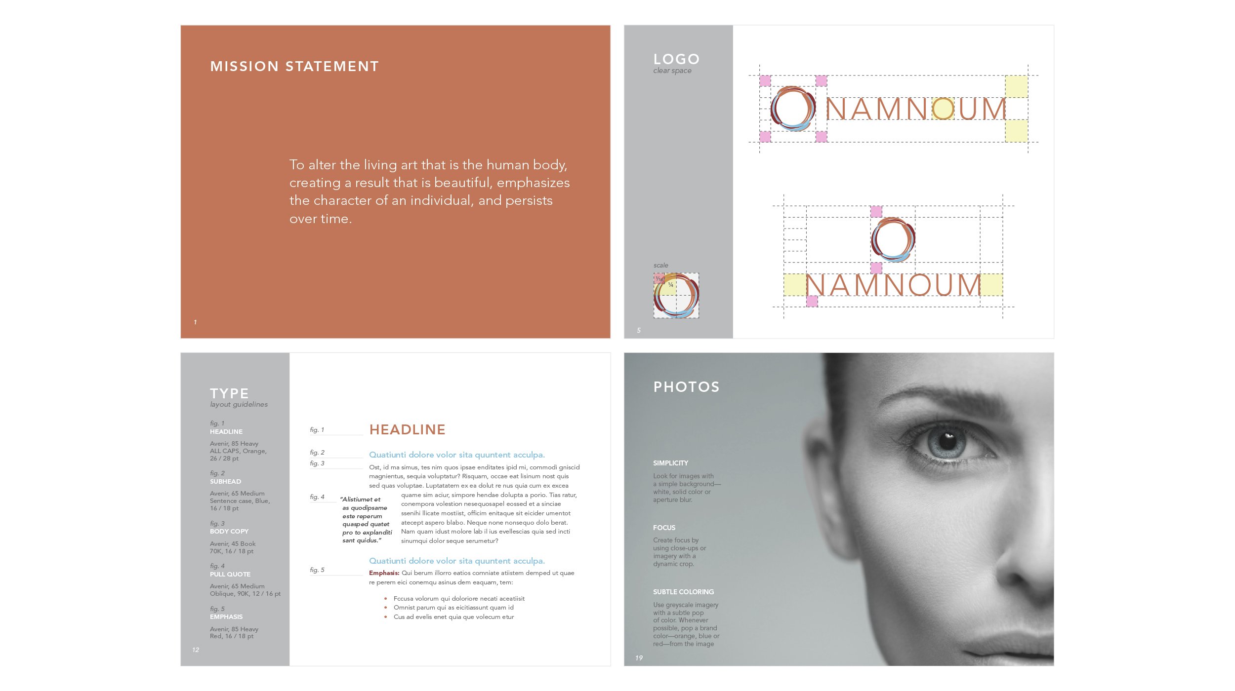
Namnoum Style Guide
This timeless modern concept stands out amid industry competition. The goal of the logo was to position Namnoum— a distinguished plastic surgeon—as an artist of the human body. The logo is composed of brushstrokes that dually represent muscular striations, while the crisp typography portrays the precision of plastic surgery. The circular shape was chosen for its association in nature with fullness and healing. In partnership with Synaptic, the brand was developed further into a Style Guide which suggests standards for logo use, white space, colors, typography, voice, photography, and basic brand assets.
Brand Identity: Logo + Style Guide
Copywriting: Greg Steen

